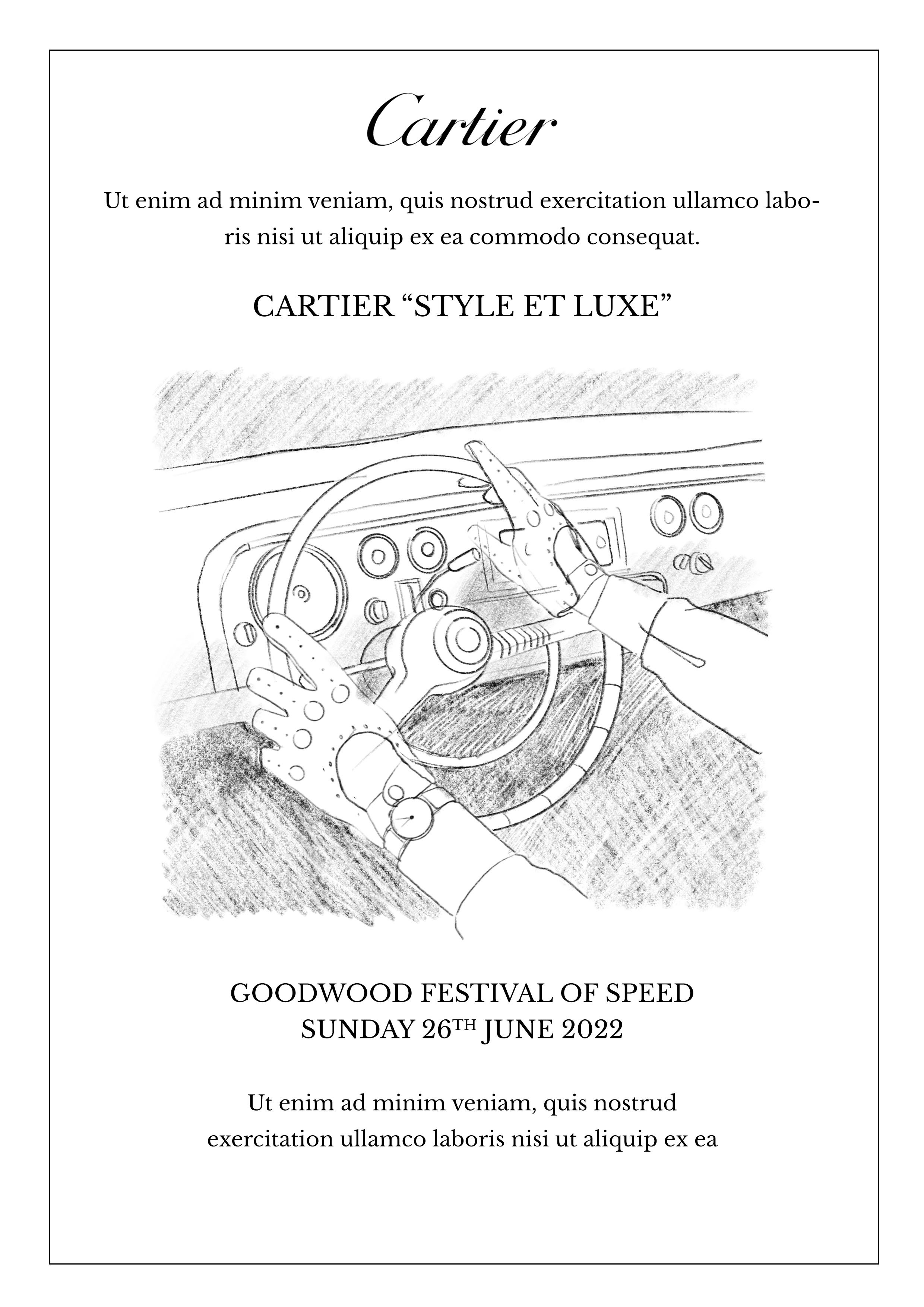
I recently created some artwork for Cartier to use on invitations for their exclusive Style et Luxe event at Goodwood Festival of Speed.

Last week, an Art Director speaking at an AOI event, said that they only worked with digital artists, because traditional artists weren’t able to make quick changes to their artwork (eh, what?!)
Now, it could be that this Art Director has made some presumptions, or they have had a bad experience of working with a traditional artist, but either way this shocked me. Is this what people think when they see my work?
So, to help commissioners understand how I work, I thought it was important to share my process. Hopefully this shows that traditional skills do not clash with quick turnarounds or client needs. In this example, the Cartier team came to me with loads of time, but this was a straight forward commission, and it was signed off within a week.
Brief
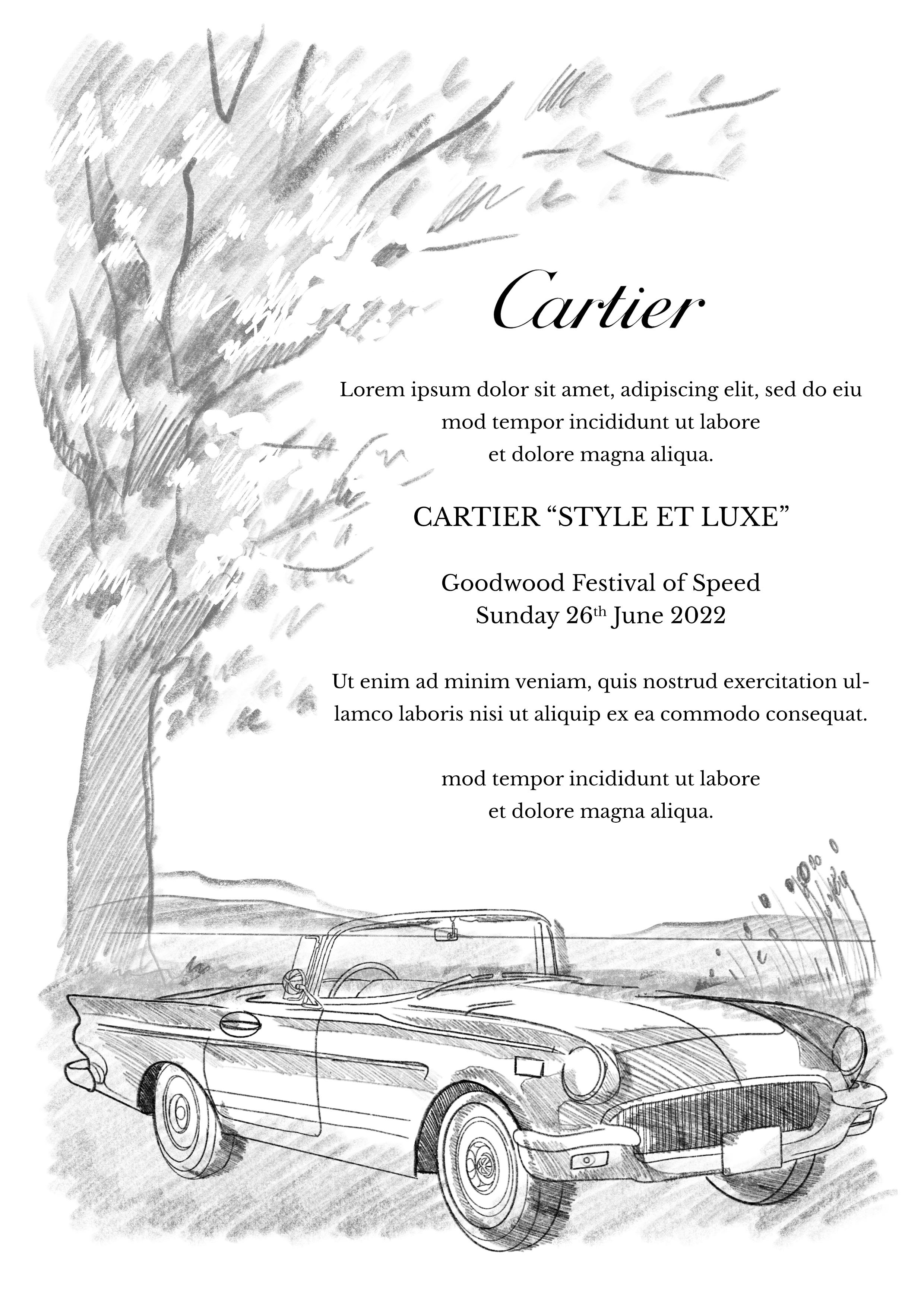
The brief from Cartier was for a classic illustration featuring the colour red. It had to demonstrate luxury vintage cars in a classic watercolour style. They asked to see an option featuring driving accessories like driving gloves.
Roughs
I created four roughs for the team to select from (below). All of my rough illustrations these days are drawn on the iPad pro using Procreate. This makes it quick and easy for me to make changes and adapt the composition.

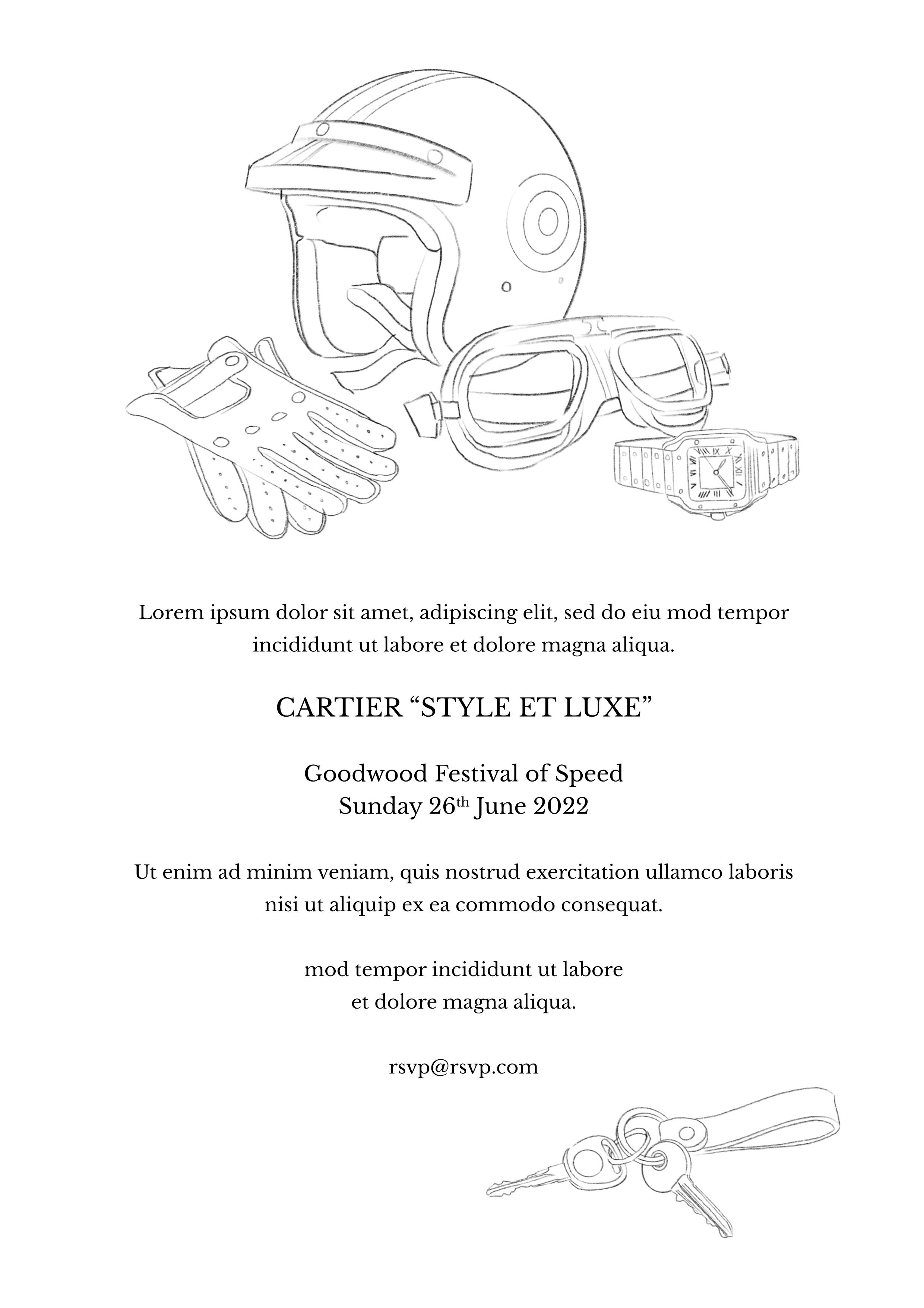
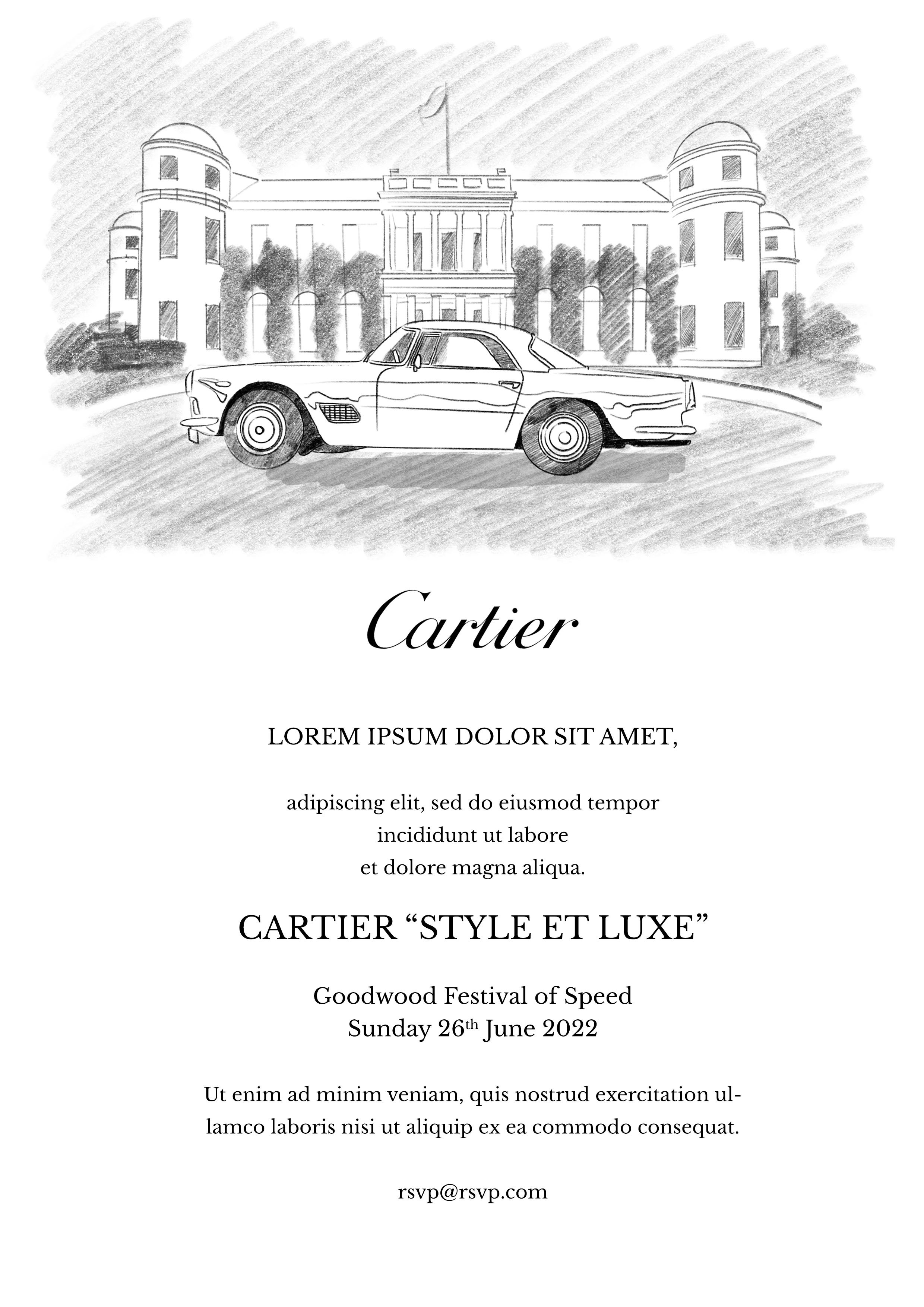
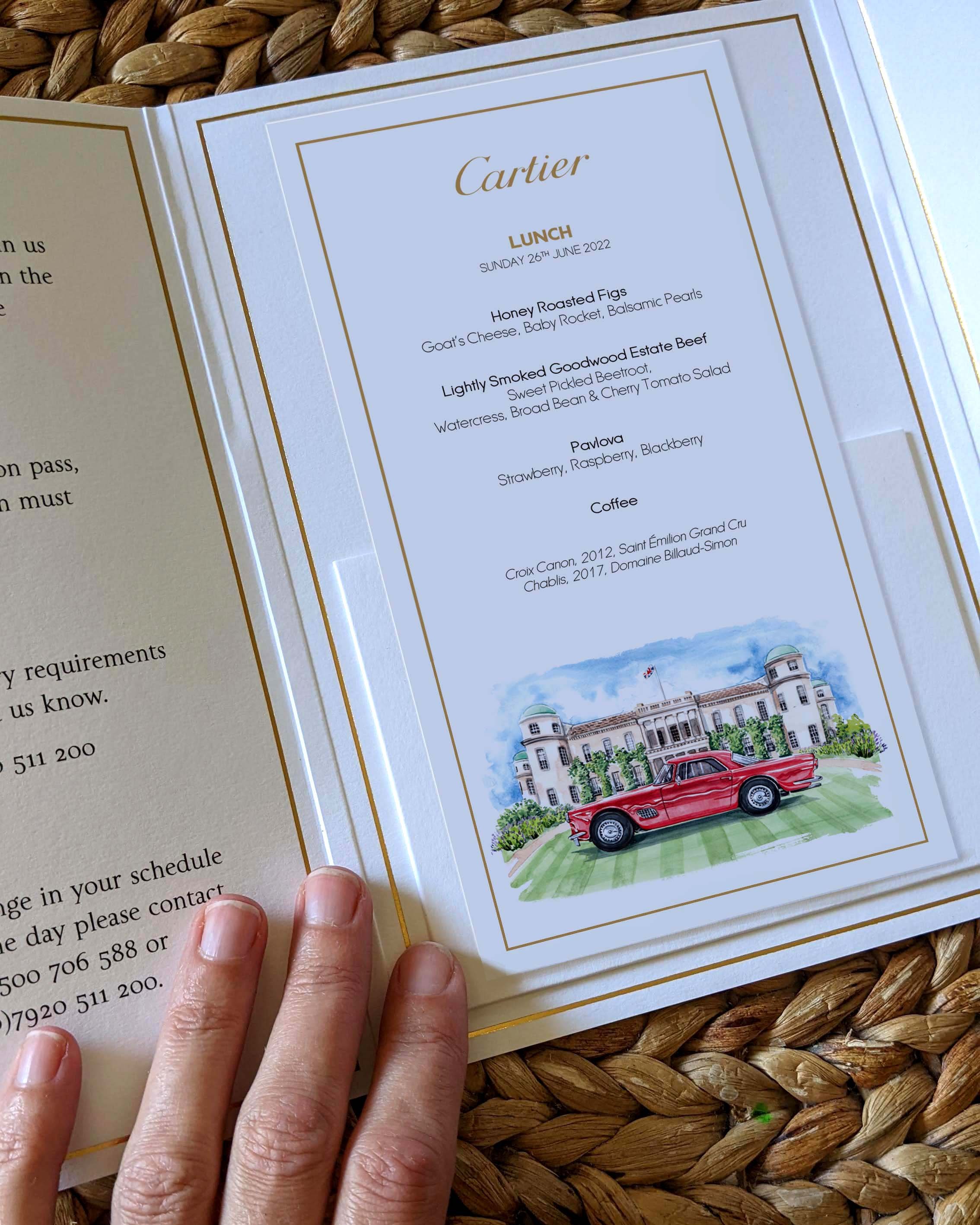
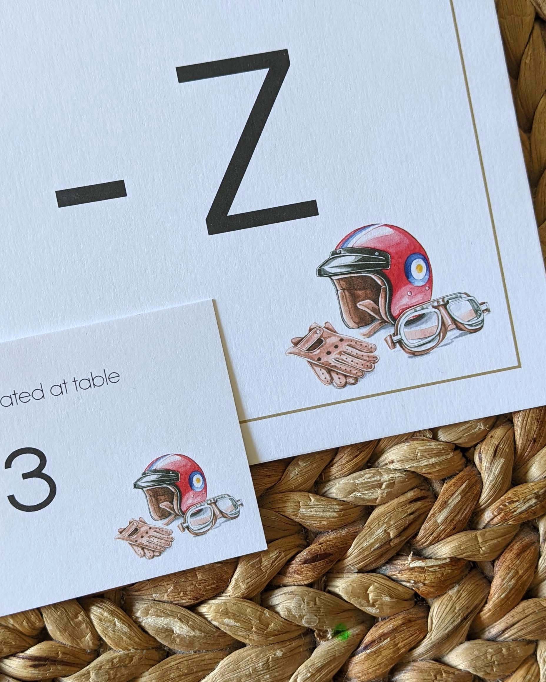
In the end, the team wanted to use a combination of two designs. The illustration of a classic car in front of Goodwood House would be used on the invitation, and the illustration of the racing helmet and accessories would be used on the table settings.

First Draft
I use the rough digital drawing to form the basis of my painting. I use the app Tracetable to turn my ipad into a lightbox, meaning I go straight from digital sketch to watercolour painting. I find painting by hand to be the quickest, and most natural way for me to work. I painted this artwork using 300gsm hot press Bockingford watercolour paper and Mai Meri blu watercolour paint.


After painting, I scan the artwork and take it into Photoshop where I can clean it up and tweak the colours digitally.
Feedback
The client liked the artwork, but asked me to soften the edges and to add lavender plants to the front of Goodwood House. Small changes like this are no problem for me. There is no need for me to repaint the whole image. Instead I use the wizardry of Photoshop to make changes - much like a digital illustrator would. Below, on the right you can see the “changes” I will make. I hand paint these elements and textures and I scan them in, and digitally add them to the painting. I find that this combination of hand-painting and digital allows me to work as quickly as a digital illustrator, but to keep that lightness that comes with watercolour.

Final Artwork

Here is the final artwork. The digital changes are impossible to see, as they’ve been cleverly manipulated by Photoshop.
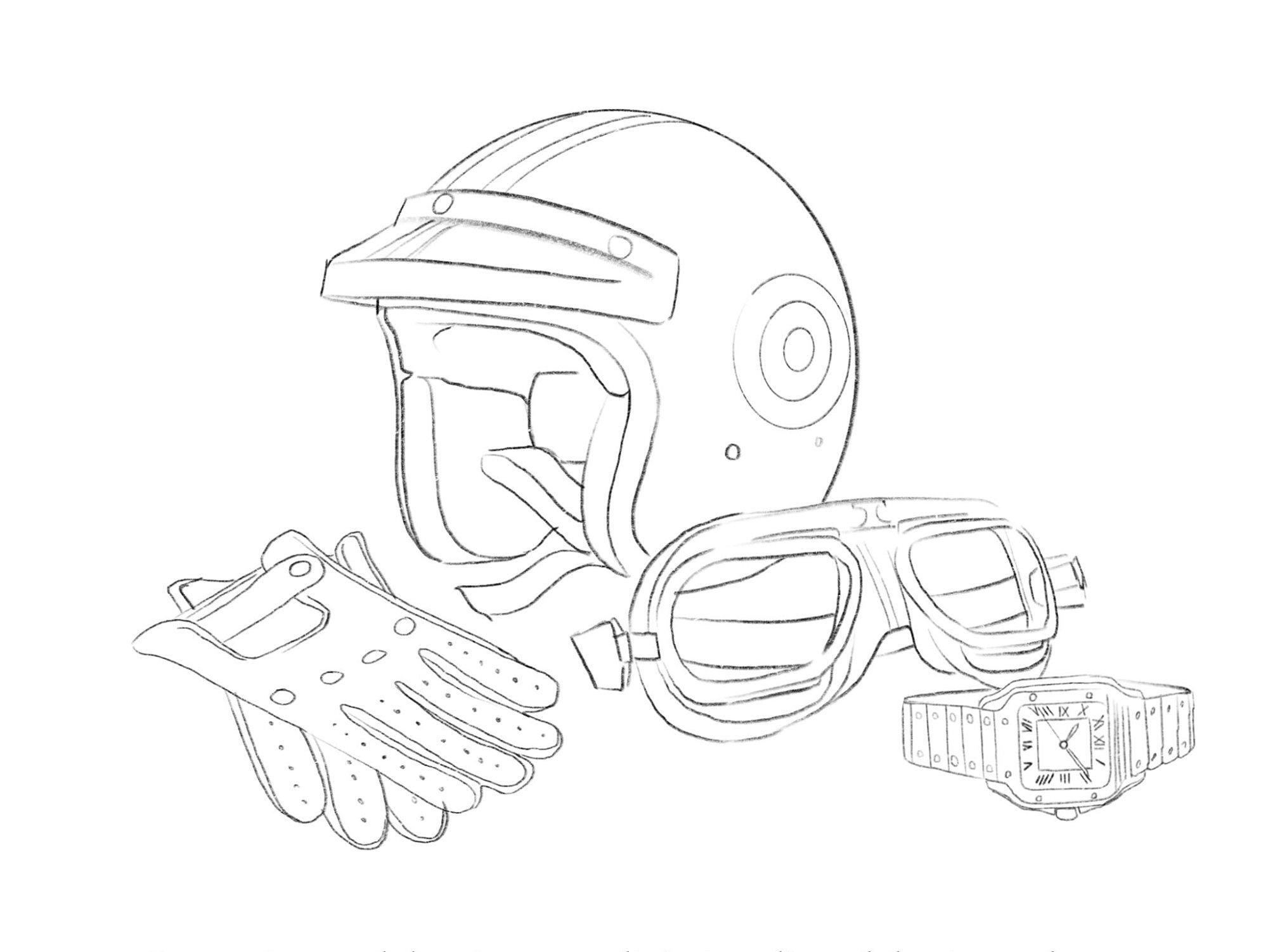
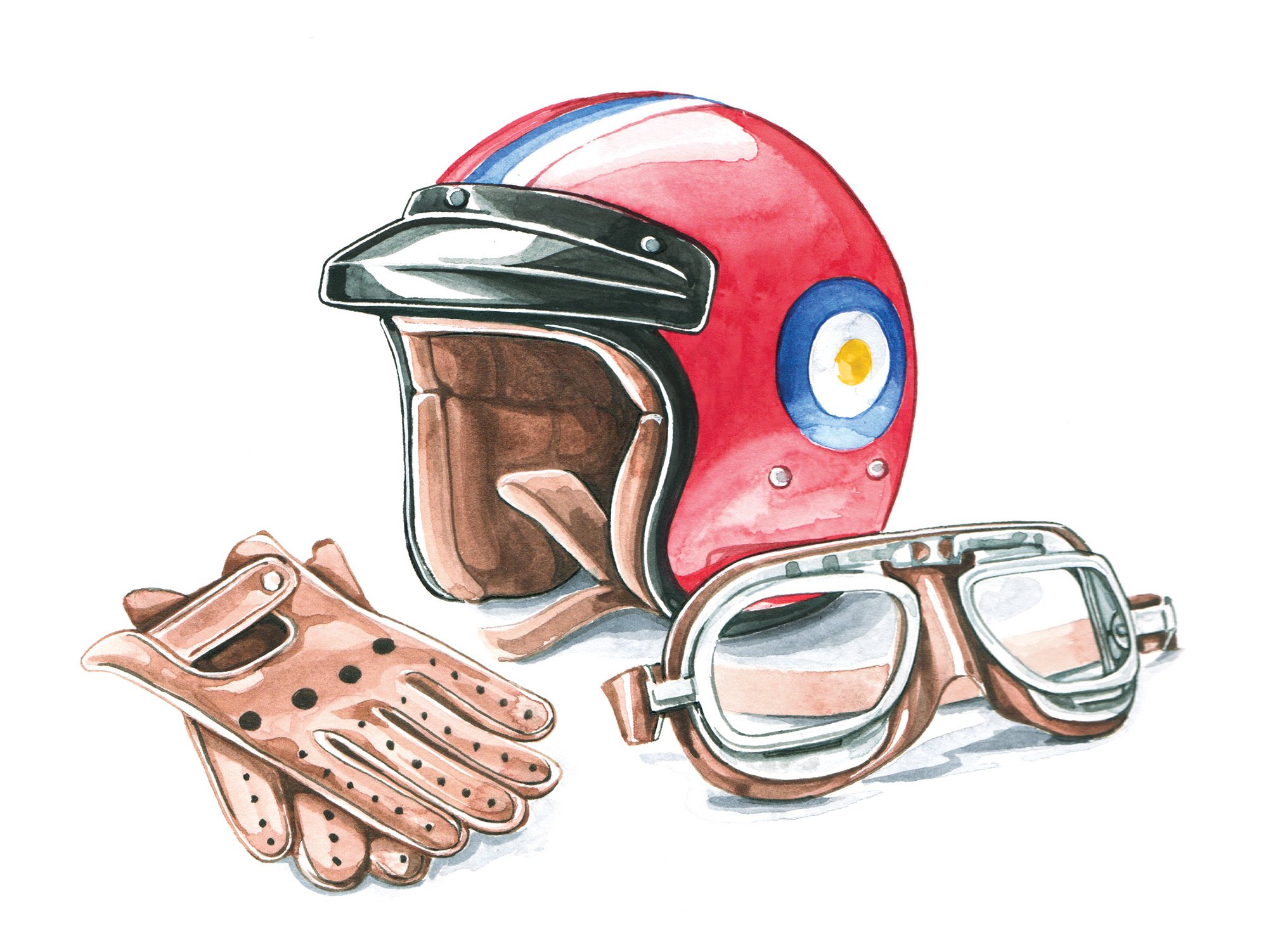
The second illustration was even more straightforward, as the only change was picked up at rough stage - removing the watch from the composition. The painting was accepted with no changes needed.
Does it surprise you that I work with Procreate and Photoshop? What do you think of my process? Has this helped clear up the process for you?
Let me know,
x, Willa